Every app you tap on your phone carries a hidden language—one you feel before you ever understand it. A simple icon can guide you, warn you, or quietly reassure you without a single word.
That is exactly the world of SF Symbols, Apple’s powerful visual system that shapes how millions of people experience digital interfaces every day.
At first glance, they look like simple icons—but behind them is a carefully engineered design philosophy that connects psychology, usability, and emotion in a surprisingly human way.
This guide will uncover what SF Symbols really are, why they matter, and how they quietly influence modern digital life in ways most users never notice.
What is SF Symbols?
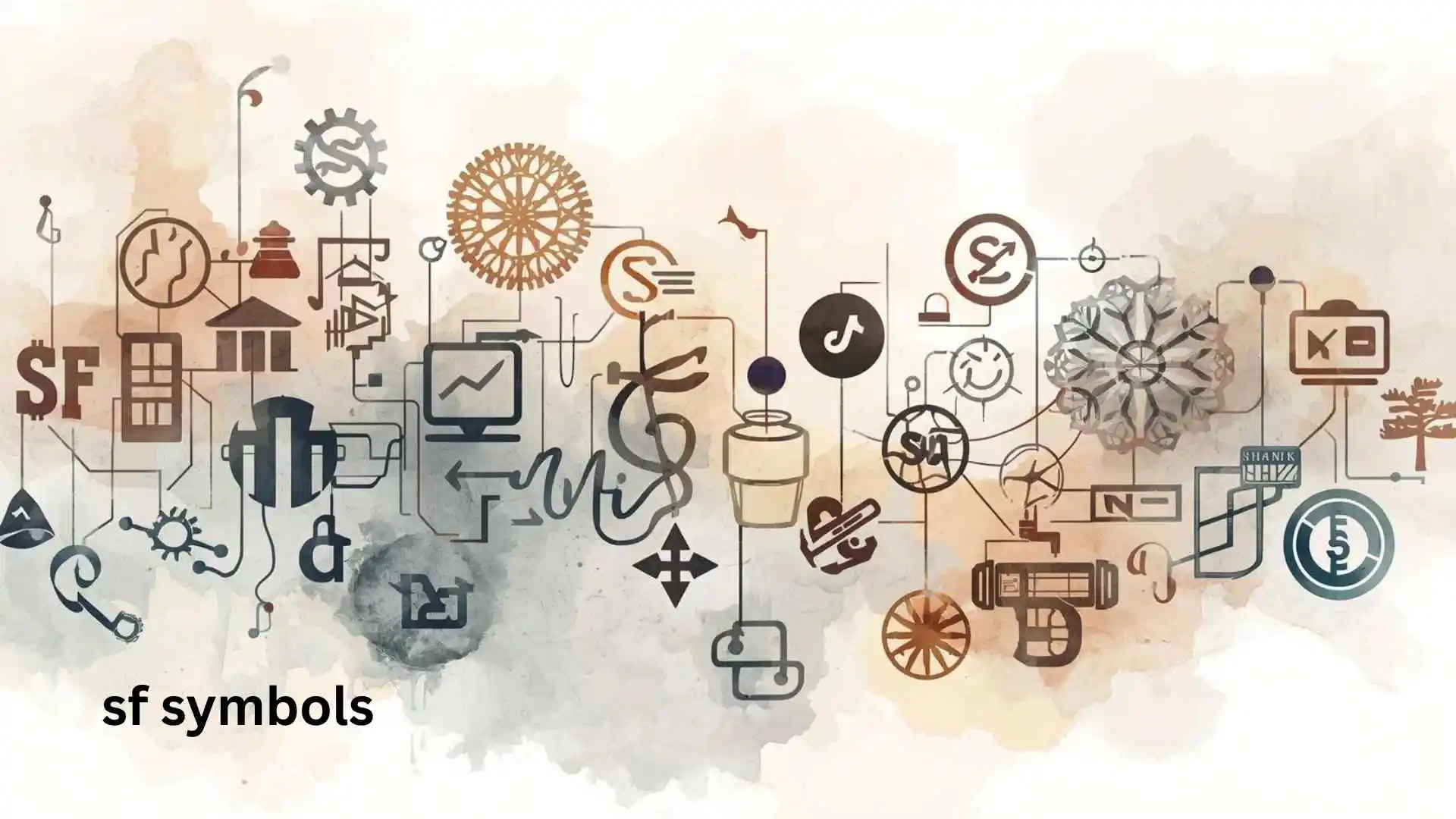
SF Symbols is a collection of iconography created by Apple Inc. for use across iOS, macOS, watchOS, and tvOS applications.
It provides thousands of consistent, scalable, and highly customizable symbols designed to match Apple’s system font, San Francisco.
Developers use SF Symbols to build interfaces that feel native, clean, and visually consistent across all Apple devices.
Unlike traditional icon packs, SF Symbols are not static images—they are vector-based, meaning they scale perfectly and adapt dynamically to different weights, sizes, and accessibility settings.
Originally introduced in 2019, SF Symbols quickly became a core part of Apple’s design ecosystem and are now essential for modern iOS app development.
Deep Symbolic Meaning of SF Symbols
Even though SF Symbols are technical tools, they carry deeper meaning when viewed through design psychology.
Psychological Level
SF Symbols reduce cognitive load.
When users see familiar shapes like a house, heart, or gear, the brain instantly recognizes meaning without reading text.
This creates a sense of comfort and speed—your mind doesn’t need to “learn” the interface; it simply understands it.
Emotional Level
Consistent icon design builds trust.
When icons behave predictably across apps, users feel safe—like they are navigating a familiar environment instead of a confusing digital space.
Cultural Level
SF Symbols reflect a global design language.
Instead of relying on culturally specific visuals, Apple’s system uses universally understood shapes that cross language barriers.
A heart means “love” almost everywhere. A gear means “settings” in nearly every digital culture.
Types / Variations of SF Symbols
SF Symbols are not just one style—they come in structured variations.
1. Filled Symbols
- Visual: Solid, fully filled icons
- Meaning: Strong emphasis, primary actions
- Where used: Buttons, active states, selected tabs
2. Regular (Outline) Symbols
- Visual: Clean stroke-based icons
- Meaning: Neutral or inactive states
- Where used: Default UI elements, menus
3. Light & Thin Variants
- Visual: Extremely minimal stroke weight
- Meaning: Subtle actions, elegance, background elements
- Where used: WatchOS interfaces, minimal UI design
4. Hierarchical Symbols
- Visual: Same symbol with multiple visual depths
- Meaning: Priority levels (primary, secondary, tertiary)
- Where used: Complex interfaces like settings or dashboards
5. Multicolor Symbols
- Visual: Icons with layered colors
- Meaning: Status indicators or app-specific meaning
- Where used: Health apps, maps, system alerts
SF Symbols Across Digital Culture
Although SF Symbols are modern and digital, their design philosophy echoes global visual traditions.
United States (Modern Tech Culture)
Used in Apple ecosystems to create a unified design language across apps and devices.
Japan (Minimalist Design Influence)
Aligns with Japanese minimalism—clean, functional, and emotionally restrained visuals.
Europe (Typography-Driven Design)
Reflects strong integration with system fonts and editorial-style UI layouts.
Global Developer Culture
SF Symbols are now a standard toolkit for iOS developers worldwide, replacing inconsistent third-party icon sets.
Modern Internet Culture
They appear in apps used daily—messages, fitness tracking, payments, navigation—quietly shaping global digital behavior.
SF Symbols in Apps, Art & Pop Culture
Apps & Interfaces
SF Symbols are everywhere inside iOS apps like Messages, Settings, Safari, and Health.
They define how users interact with technology without thinking.
Design Systems
They are widely used in UI/UX design systems to maintain consistency across large-scale applications.
Books & Learning Platforms
Many Apple design books and developer guides use SF Symbols to teach modern interface principles.
Digital Art & Design Culture
Designers often use SF Symbols as a base layer for motion graphics and app prototypes.
Fashion & Tattoos (Indirect Influence)
While not literal tattoos, their minimalist style has influenced modern “tech aesthetic” design trends in digital art and branding.
Spiritual & Dream Meaning of SF Symbols
Unlike ancient symbols, SF Symbols do not carry traditional spiritual meanings.
However, in a modern psychological sense, they can represent:
- Clarity in confusion (finding direction in digital chaos)
- Control over complexity (simplifying overwhelming systems)
- Connection (bridging humans and machines)
In dreams or creative visualization, seeing clean icons or interface-like symbols often reflects a mind seeking structure, order, or digital balance in life.
Positive vs Negative Meaning of SF Symbols
Positive Meaning
- Clarity and simplicity
- Efficiency and ease of communication
- Universal understanding
- Emotional neutrality in design
Negative Meaning
- Over-standardization (loss of creativity in UI uniqueness)
- Dependence on one design ecosystem
- Reduced visual diversity across apps
Even something as simple as an icon system can reflect the tension between freedom and structure in modern technology.
Why Humans Are Attracted to SF Symbols
Human brains are wired for pattern recognition.
SF Symbols work because they align perfectly with how we process visual information.
- We recognize shapes faster than text
- We prefer minimal effort for understanding
- We trust familiar visual patterns
- We feel comfort in consistency
This is why Apple’s design language feels “effortless”—it is engineered to match human perception, not fight it.
In a way, SF Symbols are less about icons and more about reducing friction between humans and machines.
FAQs About SF Symbols
1. What are SF Symbols used for?
They are used to create consistent icons in Apple apps across iOS, macOS, watchOS, and tvOS.
2. Are SF Symbols free to use?
Yes, Apple provides them free for developers within their ecosystem.
3. Can SF Symbols be customized?
Yes, they support different weights, sizes, and colors.
4. How many SF Symbols are there?
There are thousands, and Apple regularly updates the library.
5. Do SF Symbols replace emojis?
No, but they complement system UI and are more structured than emojis.
6. Who created SF Symbols?
They were created by Apple Inc. for their design ecosystem.
7. Why are SF Symbols important?
They improve usability, accessibility, and design consistency in modern apps.
Conclusion
SF Symbols may look like simple icons, but they represent something much bigger—the evolution of how humans communicate with technology.
They remove noise, reduce confusion, and create a visual language that works across cultures, languages, and devices.
In a world full of complexity, SF Symbols prove that simplicity is not the absence of meaning—it is the highest form of clarity.
Discover More Topics:
- German Symbols | Meaning, History & Hidden Cultural Power in 2026
- P&ID Symbols | Complete Guide to Meaning, Types & Real-World Applications

Julian Shaw
I’ve always been fascinated by the small, quiet stories that make life feel magical. Writing allows me to explore worlds that exist just beyond the everyday, where imagination meets reality. Over the years, I’ve found joy in creating characters that feel real and stories that stay with readers long after the last page. When I’m not writing, you can usually find me wandering through city streets, notebook in hand, capturing little sparks of inspiration. I believe every story has the power to connect us, to make us feel a little less alone. Sharing these tales is my way of leaving a mark on the world.
Books:
-
Whispers in the Wind
-
Shadows of Tomorrow